A2 Photography Unit 4
Wednesday, 6 May 2015
Databending Text Edit Experiment - Own Photograph
There are different ways to data bend photographs, therefore I experimented with as many ways a possible to allow me to compare the results. The result shown in this post was created by using the TextEdit program to change the coding for the image when opened within this program. The coding could be changed by copying and pasting different parts of the code and pasting it elsewhere in the code, allowing the glitch to happen.
This evidences the TextEdit program being used to change the coding for the photograph. The photograph has been opened within TextEdit to display the coding for this photograph. The code has been changed around by copying different parts of the code and pasting it elsewhere within the code, thus allowing the photograph to contain glitches.
This is a preview of the photograph which evidences that the manipulation is in progress, showing the results from the TextEdit experiment. The different parts of the code affect different parts of the photograph resulting in a variety of different colours and various different lengths of the line created. During experimenting with TextEdit I found this to be the most successful program to glitch photographs in as I prefer the line effect. This also allows for a variety of different colours to appear within the photograph rather than a select few which has happened in the previous attempts of data bending with the different techniques. However, even though this experiment works better in terms of the outcome, it is extremely time-consuming. The reason being is that if you copy and paste parts of the code to another line and this doesn't work, a section of the photograph will appear black which isn't ideal. Therefore when this mistake happens (which is very often) this has to be undone to ensure that the black section is removed. This happened an awful lot when pasting different parts of the code, especially when have very little experience with coding.
Tuesday, 5 May 2015
Databending Experiment Online - Own Photographs
I used an online glitch generator in order to get the results shown below. This allowed me to compare the different results of the outcomes due to using various different methods to create glitches within photographs.
Website: http://snorpey.github.io/jpg-glitch/
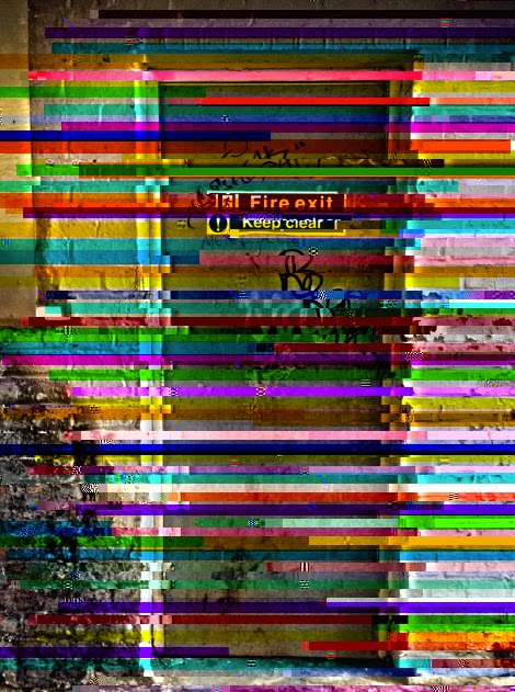
This was the first photograph used for this online glitch generator. At first I was skeptical of the results, however I was surprised at how well the photograph turned out. The photograph has been slightly readjusted in terms of moving parts of the photograph around, an example of this is the signs on the door have been duplicated and move to the left side. The photograph also makes use of colour, blue and red. The colour helps to highlight the different areas of the photograph and also help to give this a glitch appearance as it gives a false sense of movement.
This was the second photograph used within this generator, this shows similar results. The photograph uses the same method by cutting the photograph up and moving the different parts around, giving a glitch appearance. As well as this the photograph also uses the same colour scheme, blue and red. This helps highlights the different areas within the photograph as well as continuing with the glitch appearance. Overall I think this effect works well and produces an interesting outcome.
This is the same image shown above however I decided to edit the colour within PicMonkey to view the photograph in a different colour scheme.This allows a third colour to be used, yellow as well as the colour blue being changed into a more turquoise colour. As well as this the photograph also shows hint of green used in different areas of the photograph. This was an interesting experiment and overall I think this works relatively well due to the colours contrasting one another.
This photograph was produced by the same website however the levels of the different factors were changed, thus changing the outcome. This result shows that the colours are limited as they focus on using different tones of blue and green to highlight the different areas of the photograph. This result also has a difference appearance as the previous photograph cover the whole of the photograph whereas this outcome only includes lines overlapping the photograph. Therefore it is easier to view what the original photograph was. I think this affect is good however for it to be more successful this needs to have a variety of different colours or brighter tones.
Databending Experiment Audacity - Own Photographs
Audacity, a sound file program is another way of exploring data bending to create unique photographs. This technique involved exporting the original photograph as a TIFF file in order to import this as a raw data file within Audacity. This allowed the photograph to be edited such as adding the effects to the file from the Audacity effects list. Once the photograph was edited this would then involve exporting this and reopening it within Photoshop to see the desired effects.
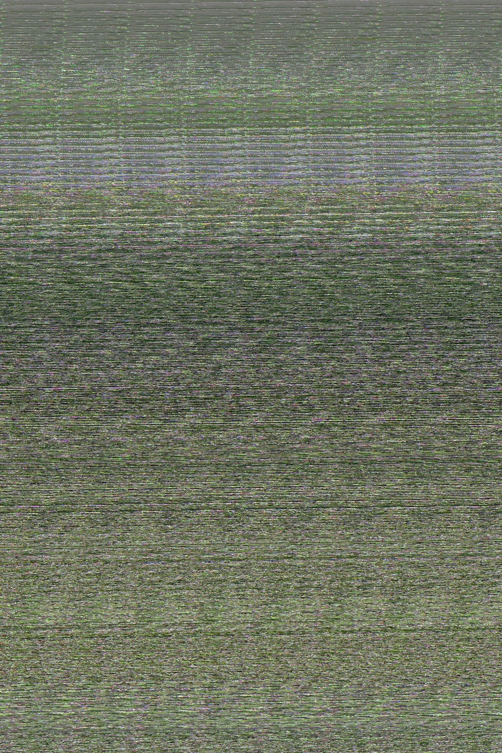
This was the first attempt at data bending the photographs within Audacity which used the Echo effect. The result wasn't as expected and I was disappointed with the overall result, especially when comparing this result to other results found online. This seems to have edited the photograph completely, unable to see any parts of the original photograph, which overall is a disappointment.
This is the second attempt at using Audacity and the effect, Echo. This attempt used a different photograph which has altered the colour of the result, from a green to a blue which contains hints of different colours. Again, this result is disappointing as it is near enough the same result as the first attempt apart from the different colours used.
This was the final attempt at using Audacity to data bend the photograph. This time I used a different effect to see if this impacted the photograph different, I used the equalisation effect. The result is near enough the same as the previous two photographs except this time the lines don't appear to be as blurry and in the middle/top half of the photograph there is a block of pure colour. The colour is also noticeably different, as this contain as extremely light red. However despite the different effect the photograph didn't have the outcome I expected as none of the original photograph can be seen due to the amount of lines used to recreate the photograph.
This is a screenshot of the file inserted within Audacity. This shows that the photograph is now being treated as a sound file, this is evidenced within the waves of the file.

This screenshot shows that I am choosing the Echo effect to experiment with the file currently inserted within Audacity.
Double Exposure Experiment - Own Photographs
After the first attempt at double exposure I decided to try this experiment again. This time I used photographs which I thought would work well together as I felt the last attempt didn't work well due to the photographs used.
This was the first photograph produced when experimenting with double exposure. This photograph uses a broad colour palette and due to the colours used this creates a vivid photograph. The levels of brightness are also reasonably high thus further enhancing the colours, making the photograph extremely eye catching. The photographs used work well together and especially with the brightness of each photographs this also helps to combine the different photographs together. The texture of each photograph can also still be seen, these are highlighted throughout the final result, showing signs of the contour of the texture created.
This screenshot evidences how the photograph was produced by showing the levels being altered within the screenshot. The levels were the key feature when creating this photograph as this allowed the colours used to be further enhanced.
Glitch Photography - Sabato Visconti
The photograph shown above shows that the original photograph which the photographer captured has been significantly edited, glutting the photograph. The photograph shown above makes it impossible to figure out the original photograph due to how edited it is. The process in which the photograph has used is data bending which allows the photograph to be edited within programs such as Audacity - a sound file editing software. Therefore importing this photograph to an audio editing program this will change the appearance of the photograph as this clearly isn't suited for audio editing programs. The photograph contains a very broad colour palette due to how edited the photograph is, however the colour of the original photograph may have impacted this. The colours for this photograph are often repeated throughout, especially blue, pink and yellow. The different tones for these colours have also been created, further repeating the colours however this has prevented the exact same colour being used repeatedly throughout. It is also evident that the top half of the photograph is remarkably brighter than the bottom half, this shows that white hasn't been replaced with grey and black in the bottom half. As well as this the photograph allows uses a geometric pattern which is repeated throughout this is made up of squares and rectangles. This allows the different titles to overlap one another, creating different colours for the tiles due to them being overlapped.
This photograph hasn't been extremely edited, thus allowing the audience to identify the original image. This appears to be of houses located within a street which have been taken from different angles. By studying the photograph clearly it appears that more than one photograph has been taken, thus allowing the artist to combine the different photographs before editing them to a glitch effect. The colour palette for this photograph uses several different colours, the main colours being green and red. These are repeated throughout the photograph, giving a slightly limited colour palette, especially when comparing this photograph to the first photograph found within this post. The colours used mix together which allows other colours to be created such as purple and yellow, expanding the colour palette. This photograph also contains geometric shapes such as rectangles and squares due to the subject matter, houses, resulting in windows. The photograph also appears to be slightly grainy, giving the photograph an older looking appearance.
This photograph focuses on being successful in terms of colour as it shows the photograph uses a broad colour palette. The colours are constantly repeated throughout the photograph with the main colour being pink followed by purple, green and blue. The photograph also concentrates on the pattern formed, this contains the geometric shapes, squares and rectangles. The photograph has been significantly edited therefore it is impossible to figure out the original photograph.
Own Photograph - Ceiling
This photograph focuses on capturing the texture of the ceiling by capturing a specific section. The ceiling shows the decay which has been caused overtime, which is probably due to the weather conditions and the current age. The colour palette for this photograph is very limited and this is mainly due to the subject matter as no other elements appear within this photograph apart from the ceiling itself. The colours used are very natural as the photograph captures a realistic view of the ceiling. The texture in this photograph is very rigid and sharp which can be evidence in the texture underneath the main layer.
Subscribe to:
Comments (Atom)


