Tuesday, 31 March 2015

Own Photograph - Alley Way


This photograph focuses on capturing the decay within the scene whilst capturing the vanishing point of the photograph by considering the composition. The photograph has been taken more to the left in order to capture the vanishing point which shows a sense of direction. The photograph uses a limited colour palette as the majority of the colours found are repeated throughout. The red located on the left side on the buildings contrasts the dark colours allowing this feature to clearly stand out amongst the photograph. The photograph captures weather, from the ground titles you can clearly see that it has been raining due to the different highlighted areas. Due to the light source this has enable the photograph to contain shadows and create highlights throughout the different elements, especially the buildings on the left side where shadows can be seen underneath the balconies.The building also show their current conditions, especially the first one in the foreground on the left side. This building shows that it is slightly worn down which is probably due to the weather conditions which have affected the building.


After capturing the photograph in colour I decided to change this to black and white as I felt that this would work well due to the subject matter. I think that the photograph works well in black and white as the this restricts the colour and focuses on using the different tonal values created by the black and white effect.  The photograph still allows the viewer to identify the decay found within the photograph, however this is more difficult to identify due to no colour being used. Due to the light source within the photograph it appears to almost give the photograph an overexposed appearance due to the tops of the buildings disappearing on the right side. 

Own Photograph


This photograph focuses on capturing the decay within the buildings whilst portraying the everyday life by capturing the street in the daytime. The photograph uses a broad colour palette due to the different colours captured within the scene. This allows for contrast to be used within the photograph as some of objects found within the scene provide contrast due to the different colours used, an example of this would be the no entry sign which contrasts the colour of the building located behind the sign. The light source provided helps to create shadows within the photograph which highlights different areas of the photograph, an example of this would be the shadows creating on and underneath the car. The photograph also uses a variety of different lines which outline the different elements within the photograph e.g. the buildings and the features on these. The photograph is also very busy, with hardly any space apart from the road area on the right side. This also helps to portray the everyday life by reflecting upon the business of the scene. Due to the angle at which the photograph has been taken it lessens the amount of detail compared to if the photograph focussed on capturing one single building. However decay can be found on the sign, the building behind the sign and on the yellow building on the left side. The decay suggests that these elements have are old and worn out however the weather conditions may have also impacted these. 

Monday, 30 March 2015

Timm Suess


Source: http://timmsuess.com

The photograph shown above focuses on capturing the decay on the different elements within the scene e.g. stairs, ceiling and the walls. The photograph uses a limited colour palette as the colours are often repeated throughout the photograph, especially grey and green. Despite the lack of colour, the window provides light within the photograph, making the decay areas easier to see. The photograph captures the different aspects of decay located throughout the photograph which is located on the walls, staircase and the ceiling. The photograph focuses on capturing the detail and the texture of the different elements found within the photograph this can be evidenced on the side of the staircase showing the harsh and rigid texture. The walls mainly focus on capturing the discolour which has clearly changed throughout time, suggesting an old building. The photographer has also considered composition by not centring the staircase, allowing the wall supporting the staircase to stand out by showing the contour. 


Source: http://timmsuess.com

This photograph uses a very naturalistic colour palette mainly due to the subject matter and the location, therefore the colours found within the photograph are often repeated throughout such a blue and brown. The colour blue helps to highlight different parts of the photograph as this stands out from the naturalistic colours such as brown, and grey. Therefore this has resulted in contrast in terms of colour within the photograph. The photograph also contains a variety of different shapes, varying from rectangles, squares, circles and cylinders.The photographer focuses on capturing a specific area of the room to display the different decay factors which have occurred over time, capturing a range of different elements which have been affected by decay. The decay found within the photograph mainly focuses on the current condition of the walls as this shows how the walls have rotted and the paint has peeled away, revealing the layer beneath.


Source: http://timmsuess.com

The purpose of the photograph shown above is to capture the decay of the car in foreground whilst capturing the scenery in the background. The car uses two main colour, white and green which provides contrast within the photograph. The photograph mainly captures the rust of the car and the discoloured elements, especially on the side, which shows how the white has discoloured to a more grey colour resulting in a rustic appearance.The photographer has captured the photograph from an angle, showing the car on an angle which has resulting in a more imposing appearance. It also appears the the reason for this is to also include the sky within the photograph, which does give the photograph a dynamic feel. The appearance of the clouds also provide contrasts as the softness contrasts the straw like grass. The positioning of the sun is also located on the left as a shadow has been created, showing a silhouette of the car. This also suggests that the photograph was taken late in the day due to the colour and overall lighting within the photograph. The location in which the photograph has been taken gives a rustic feel to the photograph as the location appears to be abandoned/run down.  

Track - Black and White


After capturing the photograph in colour I decided to change this to black and white as I felt that this would work well due to the subject matter. The limited colour helps to focus on using the tones created to highlight different areas of the photograph, especially the track and the stones. The tones used help further enhance the photograph and highlight the main focus which is to capture the condition of the track. Overall I think that the black and white effect works well for this photograph as it creates a dynamic effect due to different parts of the photograph being highlighted. As well as this the light source captured within the photograph also effects the colour of the photograph by providing shadows, allowing the photograph to contain contrast within the colour. The photograph also captures the vanishing point of the track due to the photograph making good use of composition by capturing the track in the centre. This not only captures the track clearly but this also captures the scene either side of the track. 

Again, after evaluating the photographs I decided to change this photograph to black and white as I felt that this would work well. The photograph captures the different tones, created from the black and white effect and the light source. The tones created within this photograph create a dynamic effect which further enhances different areas of the photograph and this enables the photograph to focus on this rather than focusing on the different colours. The colours used provide contrast within the photograph due to the black and white effect. Overall I think this photograph works well in the black and white effect due to the dynamic effect this gives the photograph. As well as this it also gives the photograph a powerful appearance due to the tones created which highlight different areas of the photograph.

Track - Own Photographs


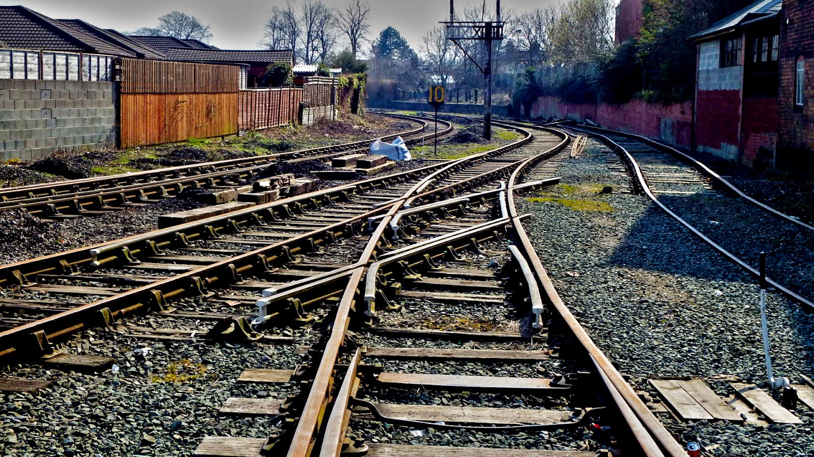
This is a representational photograph as it clearly captures a train track and the surrounding area. The photograph uses a broad colour palette which enables different parts of the photograph stand out, for example the colour of the stone allows the track to stand out clearly. The photograph focuses on using suitable composition to capture the photograph as best as possible. This involves capturing the photograph in the centre as this not only captures the track and the direction but this also captures the surrounding area such as the buildings on either side. The detail within the photograph appears in a higher quality in the foreground compared to the background, which allows me to focus on capturing the train track rather than other aspects of the photograph. The photograph uses the light source provided in order to capture the shadows which occur mainly on and around the track, this gives the photograph a sense of depth and highlights different parts of the photograph.


This is another photograph of the track which has been taken from a different point on the track, displaying the different elements such as the buildings located on the right. The purpose of this photograph was to capture the current condition of the track while capturing the surrounding scene such as the buildings. Due to the composition this has allowed me to capture the vanishing point of the track which shows a sense of direction due to capturing the bend of the track. The photograph uses a range of colours due to the different elements found within the photograph such as the track, the ground and the buildings. However the colours are often repeated throughout the photograph such as brown, red and grey. The photograph includes shadows which can mainly be found on the track, which gives the photograph a sense of depth. 


This photograph focuses on the composition in order to capture the condition of the track. This involves capturing the photograph at an exaggerated angle, this allows me to capture the track close up within the foreground while capturing the direction of the track by including the vanishing point which ends within the background. This composition allows me to focus on capturing the detail of the track as this has been captured up close, clearly showing the detail and texture. The wooden bars on the track appear sharp due to the shadows created which highlights the contour of these. The colour palette isn't particularly broad due to the lack of elements, the colours are often repeated throughout the photograph such as brown, grey and blue. 


Tuesday, 17 March 2015

Matthew Merret


Source: http://www.thephotomat.ca

This photograph uses the black and white effect to capture the decay within the room. This colour effect allows the photographer to concentrate on capturing the decay and prevent them from being distracted by the colour. This allows the photograph to contain a variety of tonal values in order to capture the decay, highlighting different parts of the photograph, thus making some parts further enhanced than others. As well as this, it also highlights the contour of the different elements especially the doors and the supporting stacks. The photograph also makes use of the geometric shapes such as the rectangles and the squares which can be found throughout the photograph. The decay found within the photograph is mainly captured on the ground as this shows the pieces of rubble and debris which have occurred over time, thus suggesting that this is an old building.


Source: http://www.thephotomat.ca

The purpose of this photograph is to capture the range of decay which is located within the room, creating various different textures. The textures within the photograph appear very sharp due to the rigid edges due to the content of the walls being worn away as well as the paint peeling off. The light within the room suggests that the photograph was captured during early hours of the morning, as very little light would appear through the blocked window, thus giving this impression. The colour palette is limited and this is due to the subject matter, often repeating the colours. The photograph also contains a range of geometrical shapes, often being rectangular which is evidenced within the window, radiator and part of the wall on the left.


Source: http://www.thephotomat.ca

This photograph contains a minimalistic colour palette due to the subject matter, using very naturalistic colours. The photograph is very  dark especially within the foreground as the light source is located near the back therefore making the background lighter compared to the foreground. The photographer has also considered composition as the have captured the photograph within the centre in order to capture the vanishing point, showing a sense of direction as this gets narrow towards the end of the photograph (background). The photograph captures a range of different decay elements, these are found on the ground, walls and the ceiling. The decay on the ground is limited as this shows the cracks and the rubble from the building whereas the decay found on the walls and ceiling shows damp and the paint being peeled away. The shadows created within the photograph helps further enhance the contour of the different aspects of the photograph especially the walls, highlighting the edges.

Monday, 16 March 2015

Polaroids - Stephen Gill Experiment

Following the research of Stephen Gill, I decided to use his technique of using a polaroid to capture photographs and further experiment with these by burying them. However the photographs didn't appear to change probably due to the amount of time they have been buried for.
The photograph shown above focuses on using light throughout in order to capture objects while giving a dark and mysterious effect. This can be seen by the the floor, ceiling and parts of the side walls appearing dark compared to the objects. When capturing the photograph I was hesitant as I didn't think there would be enough light to capture the objects, however this developed better than expect. The photograph not only capture the content within the alley way but also captures the scene within the background e.g. the buildings on the left and right, thus allowing more light within the scene. The photograph isn't high quality as it would be if taken with a digital camera, however I think this works well due to the composition as well as the highlights. The photograph also focuses on using lines and combining the composition in order to capture the scene within the background, outlining the different buildings. The colour of the photograph is subdued and the colour palette is limited, especially within the foreground due to the amount of light. However I think this suits the photograph due to the subject matter as alleys give the impression of a dark scene. The purpose of the photograph was to capture the scene within its current state although I don't feel that this aspect has been successful to due the light impacting the quality of the photograph. 


The purpose of the photograph shown above was to capture the decay located on and around the door as well as capturing it's current state. This also portrays society due to the state of the door, e.g. the graffiti located on the door. The photograph didn't develop as well as expected, this is due to the light, almost overexposing the photograph, impacting the overall quality which is evidenced on the walls as the bricks can't be seen and nor can the texture. The photograph also lacks in terms of colour as colours are often repeated throughout the photograph which is mainly due to the subject matter. However due to the colour which appears on the door this provides contrast within the photograph due to the background mainly being white. The photograph lacks quality therefore this has impacted the texture and decay when capturing the scene. The intention for the photograph is there, however for this photograph to be successful the photograph needs to contain the right amount of light and the door needs to be more central as this is the main focus. 


The purpose of the photograph shown above was to capture the decay and state of the wall within the scene. The colour palette for this photograph is limited as the colours are often repeated due to the subject matter and the contents found within the photograph. This provides contrast within the photograph, especially the colour of the graffiti contrasting the wall. Due to the photograph being captured within a polaroid this has impacted the light within the photograph, this is evidenced within the sky as the sky is completely white. The photograph works well in terms of capturing the detail of the scene e.g. the bricks within the wall. However the photograph didn't turn out as well as expected, the intention is there but the photograph has been captured on a slight angle and in order for this to be successful this needs to be captured correctly. 


This photograph focuses on capturing the current condition of the alley way while also capturing the direction by considering the composition. The quality of the photograph isn't particularly great therefore this lacks in detail especially when trying to show decay located on the bricks within this alley way. However even though this lacks in terms of capturing the decay it is successful in terms of capturing the direction/shape of the alley way. This is due to the composition as it was captured more on the left side rather than central or on the right side as this allows me to capture the indent of the wall. The photograph also isn't completely focused as the background is out of focus, resulting in the background being blurred whereas the foreground is slightly more focussed. The colour palette is restricted due to the subject matter and the limited elements therefore the naturalistic colours are repeated throughout. 


The purpose of this photograph was to capture the decay of the wall close up as the previous photograph struggled to show this due to the quality of the polaroids. The quality of this photograph isn't as good as it would be if it was captured digitally, however it is enough to identify the different decay aspects. The photograph displays the texture of the brick wall which shows sharp and rigid edges as parts of the bricks located at the top appeared to be have worn away. The colour palette is also very restricted due to the content within the photograph as this only contain a brick wall and a pipe, therefore the naturalistic colours of the bricks are repeated throughout the photograph. The colour of the pipe also contrasts the colour of the bricks, allowing it to stand out in between the bricks.


James Wakefield


This is a black and white photograph produced by James Wakefield. This photograph captures the current state of the building which captures the decay. The composition of the photograph isn't as accurate as it could be, when viewing the top of the photograph it shows that the photograph has been taken on a slant. However the photographer has considered the composition of the photograph by capturing the decay close up rather than far away. The photograph doesn't capture a huge amount of detail, especially within the bricks. This may be due to the camera used to capture the photograph or the photograph could be further edited to enhance the photograph. The photograph does contain contrast which is shown in several ways, in colour and in the subject matter. The photograph contains contrast in terms of colour due to the use of black and white, which contrasts one another. The photograph also contains contrast in terms of subject matter, for example at the top of the photograph, one door contains shattered texture from the wooden panel whereas the other door contains a wooden panel.


The photograph shown above, again captured by James Wakefield makes use of the black and white option. The purpose of the photograph is to capture the current state of the building such as capturing the decay shown on and around the gate. The photographer has considered the composition carefully by capturing the gate and door frame within the centre of the photograph. As well as this they are also able to capture the other elements within the setting such as the bars. This gives them a better view of the decay around the gate The photograph is restricted in terms of colour due to the black and white option being used. However the restricted colour highlights the different areas of the photograph through the use of tones and shadows. The exposure of the photograph suggests that there was a light source within the location as the walls are very exposed. The photograph also captures the texture of the gate due to the paint peeling off, showing a rough texture. The photograph also contains  a shadow of a figure .in the background, this may have been added to add more elements within the photograph. 

Yassine Hakimi


This photograph focuses on on capturing the wall and the door by using the black and white option in order to capture the decay found within the location. The photograph contains contrast in colour and in the subject matter. The photograph is contrasted in terms of colour due to the black and white contrasting one another. As well as this the photograph also contains contrast in terms of subject matter due to the different decay elements, for example the door seems slightly worn away and abandoned due to the paint sprayed over the door. Whereas the wall contains contrast in terms of its state, it seems to have been worn away due to weather conditions thus causing decay to occur. The photographer has also considered the space and composition of the photograph. The photographer could have chosen to centralise the door however the photograph decided to capture the door towards the left side, allowing them to capture the space on the right side. 


The photograph shown above focuses on capturing the decay located on the different elements in the scene. The photographer has taken the photograph on an exaggerated angle allowing them to capture a sense of depth and movement, an example of movement would be the frame of the bed. The bed frame gives a sense of movement due to the angle at which the photograph has been captured from. This impacts the overall photograph as not does the photographer capture decay but they also capture a sense of movement, creating a dynamic effect. Due to the photograph being captured on an angle this reduces the detail of the bricks as it focuses more on the frame of the bed and the floor. However you can still see the decay within the photograph such as on the floor and bed frame where there appears to be rust. The walls within the foreground also display a slight worn out texture suggesting that the room appears to be abandoned.The colour palette for this photograph is slightly subdued and the colours are often repeated throughout mainly due to the subject matter. The light within the photograph gives the viewer a sense of time, from the photograph I would say that this has been taken during the day due to how much light is within the photograph.

Thursday, 12 March 2015

Own Photograph


This is a representational photograph which clearly evidences an alley way and the content of this. The photograph uses a naturalistic colour palette giving a realistic impression of the location captured. The colour palette is subdued and the colours are often repeated such as brown, grey, white and red. This are repeated throughout due to the subject matter captured, limiting the variation of colours. The photograph uses composition in order to capture the direction of the alley way this is displayed by capture the shape of this, the bend to the left. The photograph is more focused within the foreground compared to the background. Therefore this is easier to view the detail within the elements, such as the current condition of the ground as well as the condition of the wall on the left. The texture of the walls aren't relatively clear however the wall on the left shows signs of the paint being peeled away, thus suggesting a harsh texture within the wall. 

Monday, 9 March 2015

Pinhole Camera Negatives


A pinhole camera was used to capture photographs in different locations. However the photographs which were to be used for this unit haven't developed as well as expected and unfortunately no photographs were able to be used. This experiment will be attempted again to try and develop some photographs which will show a different outcome compared to a digital camera.